 Nexus KitNexus Kit
Cards are used to display related contents and actions.
card content
card content
card content
import { Card, CardHeader, CardTitle, CardBody } from '@/components/ui/Card';
import Button from '@/components/ui/Button';
import { IconDots } from '@tabler/icons-react';

export default function Page() {
  return (
    <Card className="sm:w-80">
      <CardHeader>
        <CardTitle>Card Title</CardTitle>
        <Button icon size="sm" variant="light" colors="neutral">
          <IconDots size={16} />
        </Button>
      </CardHeader>
      <CardBody>
        <p>card content</p>
        <p>card content</p>
        <p>card content</p>
      </CardBody>
    </Card>
  )
}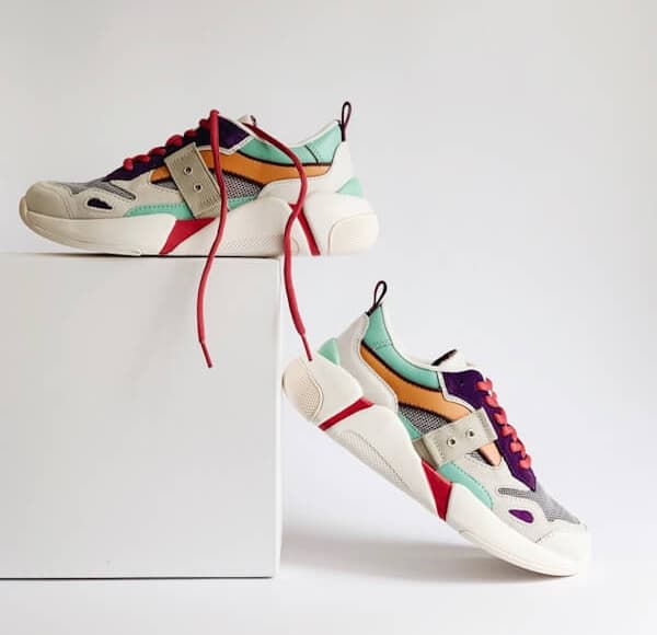
Brand Shoe
Size: 40
total
$50.0
import { Card, CardHeader, CardTitle, CardBody, CardFooter } from '@/components/ui/Card';
import Button from '@/components/ui/Button';
import { IconDots } from '@tabler/icons-react';

export default function Page() {
  return (
    <Card className="sm:w-80">
      <CardBody className="border-line flex items-center gap-3 border-b">
        <Image src="/images/shoes.jpg" alt="shoes" width={600} height={580} className="size-20 rounded object-cover" />
        <div className="flex-1 text-sm">
          <p>Brand Shoe</p>
          <p className="text-description">Size: 40</p>
          <div className="mt-2 flex justify-between">
            <span>$25.0</span>
            <span className="text-description">x2</span>
          </div>
        </div>
      </CardBody>
      <CardFooter className="flex justify-between">
        <div className="text-sm">
          <p className="text-description">total</p>
          <p>$50.0</p>
        </div>
        <Button pill size="sm">
          Pay Now
        </Button>
      </CardFooter>
    </Card>
  )
}